1. preamble
The third and final paper from my PhD thesis is published, just in time for when my degree is processed at the end of 2020. I am irrationally happy and proud about this fact, because of the weird feeling of completion it gives me. Like, I’m done. But what I feel more strongly is a marvel at how shit works out sometimes. This paper, as a scientific discovery, has its own narrative that best embeds itself within ongoing research efforts. This narrative is simultaneously true and fabricated: from the introductory references to earlier works, through every step of the results, to the future outlook—these are 100% scientifically accurate. At the same time, as I’d written earlier last year, this narrative is typically organized after the fact. The process of discovery often looks nothing like the structure of the paper, but it’s this process and this story that I find more fascinating, both in my own work and in that of others. That story is one that embeds in my own life over the last two years, through ups and downs, and that’s the story I want to tell here today. I want to say that it’s for an educational purpose, but mostly it gave myself some good chuckles.
Life’s comedy is inspired by tragedies, especially someone else’s. From that perspective, this blog post probably won’t be anywhere nearly as entertaining as the organoid one, because I’m not unleashing 5 year’s worth of pent up frustration and despair in one sitting. It was all quite pleasant, actually. Nevertheless, I want to share some “behind-the-scenes” commentary, if for nothing but as a reminder for myself that science (so far) is basically stumbling around in the dark until you find something, and then connecting all the most important dots in reverse (much like life itself). In fact, I think the central theme here is probably my appreciation for the incredibly fortuitous alignment of stardust in the universe to bring this together. My mom says my blog posts are getting way too long for one sitting, so I’ve cut the 8000-word essay into 3 parts. The next two parts will be released a few days later, you can find them here: Part 2 and Part 3.
If you want a quick overview of the scientific points in plain English, there’s a nice “digest by eLife” that summarizes the findings. Or there’s always the tweetprint. My hope for this series of posts, however, is that by witnessing how the process unfolds, it will provide people with a deeper understanding of the science, as well as, once again, how science actually works in a very human world. I call this blog post the Director’s Cut because if I had my way, this is the paper I would have submitted to journals. Maybe if/when I become a graybeard. But before I get into that, what does the vanilla edit look like?
2. “the commercial cut”: curated scientific narrative
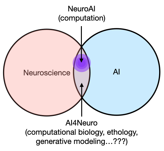
In a nutshell, this paper presents a novel analysis method (i.e., a little math and code) for estimating “timescale” in neural time series—a fundamental quantity that characterizes the activity of a neuronal population over time (i.e., dynamics, more details below)—and applies it to measure cortex-wide timescale from invasive recordings (ECoG) in humans and macaque monkeys. More broadly, it combines several other datasets of various modalities, including bulk and single-cell gene expression, structural magnetic resonance imaging (MRI), and behavioral data to probe the physiological basis and the behavioral relevance of this “timescale” quantity across the brain. The narrative in the paper (and the eLife digest) implies that we identified an existing need to be able to estimate timescale from the human cortex, thus inventing a method to do so. Having done that, it enabled us to answer many outstanding questions that could not have been directly answered before, like which cellular and network properties shape cortical variations in timescale, how timescale is important for supporting functions like memory, and even more relevant for us human beings: how it breaks down when people get older.

As the schematic figure shows above, we address these questions with a kitchen sink worth of heterogeneous datasets. I had to learn a lot of random things and talk to people with expertise in those areas to be able to handle all this data. Regardless of the “discovery” itself, I’m happy about this point, and in some sense I feel like this is the “magnum opus” of my PhD because it adheres very closely to my belief that variation in brain structure gives rise to variation in brain dynamics, which is then hijacked for “computation” or brain functions in general. Therefore, I think it’s important to do work that can address as many points along this spectrum as possible—”full stack” neuroscience, if you will. If you take away nothing else but this point from here, I’d be very satisfied.
At the same time, however, I’d be lying if I said I knew these were the questions we wanted to answer, and how they were going to be answered, on day 0 of this project. Actually, that couldn’t be further from the truth.
3. birthing the project from extreme volatility (October 2018)
At the time this project began, I didn’t know what a “neuronal timescale” was, nor did I know that this became an extremely hot topic in systems neuroscience in the last 5ish years. Honestly, not a single clue, and I’m not sure if Brad knew either. Instead, at the time I was on a deep dive about 1/f exponents and how the various analysis methods for time series data—in particular, power spectrum exponent and detrended fluctuation analysis (DFA)—related to each other in measuring scale-freeness in brain activity, after my first paper. Scale-free, as in…a total lack of (time)scale.
How this project started had nothing to do with science, we didn’t set out to measure timescale in humans because we inferred that it was an open question. Like I said, zero clue what that was. No, it was much more pedestrian than that. The ingredients necessary for the birth of this project were: 1) a very tumultuous period of my personal life, 2) a change in my eating habit, 3) a lab very tolerant of my antics, 4) the knowledge of a small and otherwise useless piece of math, and 5) luck.
I’ve told the story about the log-log argument (below) in a few talks already, including at my defense, but I never told the story of why I was so invested in that debate that morning. It’s not because I cared SO much about policing how somebody wants to plot their power spectra, it’s because I was perpetually emotionally volatile and extremely hangry that particular morning. Well, every morning in those few months: volatile, because I had been in a very long-term relationship, one that had sadly ended in the summer of 2018 (ingredient 1). I obviously never talked or blogged about it because it’s a private part of my life and I didn’t think it was relevant for science, but in hindsight, what happens in your personal life is very much a part of the science you do, for better or for worse.
In my case (and probably in every case), what follows an extremely difficult breakup is a lot of drinking (and usage of other substances), not so much sleeping, and an increased baseline level of irritability and sadness, among other emotions. To offset those very unhealthy fluctuations, I decided I was going to work out a lot and eat well, so much so that I thought I’d try intermittent fasting, which meant eating 3 meals between noon and 7pm (ingredient 2). That worked out great because 1) I was probably in the best shape of my life despite the enormous caloric intake in the form of liquid bread, and 2) I was really focused (on the non-hungover days, obviously) between 9am and 12pm because I’d work at home in those morning hours.

I still do this when I can, and the hanger is totally great for working alone, because I didn’t think about much else. What it’s not great for is when you have to interact with other people, in real life or virtually, so I don’t usually check messages. But, on this random day in October, the melting pot of {crippling depression, irritability and aggression at everything that shines in life, and hanger} that is me, happened upon a poor soul who shared on Slack a power spectrum plotted in semi-log.

I guess I should take this opportunity to apologize once again to everybody: I’m sorry, I was hangry. I’m currently digitizing my old notebooks before the move to Germany, and happened upon this gem from October 2-5, 2018:
“Weird day. I snapped on Slack about the loglog plot. Not sure why I got so frustrated, I think because they were shooting it down without good reasons. In any case, then I couldn’t do anything all morning for some dumb reason. […] I’ve felt a subtle desire to just cry to somebody for a while now, like literally, and I’ve been surprised I haven’t been able to. […] intermittent eating has made me feel very energetic, even though I was a bit unhinged on Tues. I think I need to consciously manage this energy better.”
Thankfully, my lab was (and has always been) tolerant of my moods (ingredient 3). But just to make sure that I don’t forget about it, this debate has reached meme status, with a custom Slack emoji (pictured above).
4. technical tangent: frequency representation of exponential decay
Okay so what’s the loglog fuss about? To review, the frequency representation (i.e., “power spectrum”, or PSD) of brain signals—EEG, MEG, and intracranial recordings (ECoG/LFP)—almost always follows an 1/f power law: 1/f here meaning power (or energy) scales inversely to (f)requency, such that lower frequencies typically have larger amplitudes when represented as sine waves. It is my belief that people can judge the slope of a line (or the straightness, for that matter) much better than they can judge the curvature of an inverse power law curve, and so given that we’ve been looking at this 1/f phenomenon in neural data for a long time now, it’d just be easier for everyone to assess the “quality” of the power law when you see it as a straight (or not) line, which it just happens to be when you make both X- and Y-axis in log-scale. Hence, log-log.

Through discussions with lab folks prior to this little fiasco and from looking at a lot of ECoG and LFP PSDs (including my first paper on 1/f exponent & E/I balance), I knew that more often than not, neural PSDs are not purely 1/f power law. Instead, when you plot the PSD in loglog, there’s often a little bendy part around 10-30Hz, which we now call the “knee”. The small piece of math (ingredient 4) I happened to know was that the presence of a knee that connects a plateau portion (flat line) and an 1/f portion (line sloping down) indicates an exponentially decaying process—something much less mysterious than power laws—and that where the bendy knee occurs in frequency (in Hz) is a direct transformation of the exponential decay “time constant” (in seconds), or sometimes referred to as…“timescale” (math details in the methods section of the paper).
Exponential decay and decay time constants are ubiquitous concepts in the physical sciences, and most of you probably know it in the context of radioactive decay (e.g., carbon dating), so I will use that to explain it: different atomic elements are different in their “stability”, or how long they tend to keep a certain form before they spontaneously split into something else. Sometimes, the same element can split into a different form (or isotope) of the same element because neutrons shoot off, like Carbon-14 to Carbon-12, which is really useful for determining the age of a fossil sample. Sometimes, they split into two entirely different elements, like Plutonium-238 into Uranium-234 and whatever else. For the purpose of this metaphor, it doesn’t matter what Carbon-14 splits into, just the amount of time it typically takes to split (though the dissipative loss may have a nice analogy in the brain):
Carbon-14 has a “half life” of 5730 years, which means if some sample of really old shit (literally) has 100 C-14 atoms today, 5730 years later, only 50 will remain, the other half having spontaneously split into C-12 atoms. 5730 years from then, only 25 C-14 atoms will remain. So on and so forth. Carbon dating works by measuring how much C14 is in a sample today, hence inferring how much C-14 was lost and how much time has elapsed since that bison made that poo (or something to that effect).
If you chart how much C-14 remains over time, you will observe an “exponential decay curve”—the ratio of C-14 lost is the same over a constant period of time. You can characterize this curve with a single parameter, and that’s its decay time constant, which is a physical quantity of time (i.e., 5730 years). In contrast, compared to C-14, plutonium-238 has a much shorter half-life (87.7 years), so it’s more radioactive or volatile. If you chart the amount of Pu-238 over time, that curve falls much more quickly, like the yellow vs. the purple curves below. Note that, by convention, when we talk about half life, that number is reported as how long it takes for the “amount of stuff” to decrease by half. When we talk about exponential decay, the time constant reports how long it takes before we only have “1/e” amount of it, e being Euler’s number here, 2.718….so maybe we should call it e-Life… whoa.

In formal parlance, we’d say that the process of radioactive decay of C-14 has a longer timescale than Pu-238, and intuitively, C-14 is more stable and has a longer “history” that one can utilize (like for carbon dating). This idea of decay constant not only applies to radioactive elements, but any quantity that can be measured which exhibits spontaneous (and “memoryless”) decay over time, and it doesn’t even have to be physical “stuff”. And as I soon discovered, the idea translates perfectly to measuring “the amount of brain activity”.
5. what the f is a “neuronal timescale”? (still October 2018, 3 days later)
Back to the story: having gotten so invested in the log-log interpretation, I had to prove in some way that I was right, or at least that I didn’t make a stink for nothing. So I used our handy lab tool, spectral parameterization (thank god for Dr. Thomas Donoghue for making this thing so damn usable), to fit some modified 1/f curves (with the addition of the knee parameter, or a “Lorentzian”) to some macaque ECoG data from Neurotycho (the patron saint of my PhD).

What I wanted to prove was pretty trivial: that by including this knee parameter, the resulting 1/f exponent fit—the thing we actually cared about at the time—was much more accurate compared to slapping on a naive 1/f curve…because the whole thing is clearly not a straight line. The fact that the “knee” translated to a time constant (or “timescale”) estimate was inconsequential. But this is where ingredient 5 (luck) came in, for the first of many times over this project. I remember this really clearly because I was flying up to Berkeley to hang with some derps for the weekend (this was October 4), and because one of the night resulted in this gem of a picture triple clutching in one hand (I swear, this was a special period of my life):

The lucky part was that I happened to be reading this paper on the plane: “A Hierarchy of Intrinsic Timescales Across the Primate Cortex”. I’m not sure why I was reading it, probably because it was tangentially relevant to “scale-free”. But in this paper, the authors demonstrate that the activity of single neurons across the monkey cortex also exhibit this property of exponential decay. More interestingly, different brain regions have different decay timescales: sensory regions responsible for processing fast-changing perceptual information have short timescales like the more volatile Pu-238, while association regions thought to support long-term information integration (like in working memory and for making decisions) have longer timescales like the more stable C-14. This makes a lot of sense, and this work is one of the earlier ones that set off an entire line of research on timescales in the brain. But I’m highlighting this one in particular because, thank holy heaven, John Murray put the estimated values of the spiking timescales in Figure 1.
So then here comes lucky me: what if we compare these single neuron timescale values from this paper, with the timescale values I got from the Neurotycho ECoG data in the corresponding brain regions?? After some amateur-hour macaque cortex alignment (and I do mean amateur-hour), I copied over the single unit numbers from the paper (x-axis below), then grabbed estimates from the ECoG electrodes that matched where the single units were recorded (y-axis below), plopped them into Python and did some averaging, and got this:

“holy shit is this real? …I must have plotted one set of numbers against itself?” That’s pretty much the conversation in my head. This is about as good of an “aha-moment” as I can hope for in the computational sciences. Came home after the binger weekend, showed it to Brad (similar disbelief), checked over everything a couple more times, ran a few other sessions from the Neurotycho dataset, and it didn’t break! That was the first result of this paper, probably late October of 2018, because it was right around the Cosyne submission deadline. I was working on some other weird dynamical systems thing that I was going to submit but none of it ever fucking worked. So I wrote this result up like 3 days before, Googled and slapped together a few references on macaque cortical timescales, sent it in, prayed to the LFP gods, and went on to do pretty much nothing the rest of 2018.
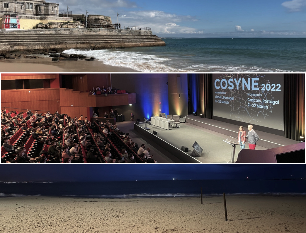
And those were a couple of months in my life that I still think very fondly about. Stayed tuned for Part 2, in which I get even luckier, but in Lisbon, Portugal.
Post-script for the aficionados: you will notice in the above plot that while the single neuron and ECoG timescales follow each other very closely, they are actually off by a factor of 10. That is, single neuron timescale are on the order of hundreds of milliseconds, while ECoG timescales are in the 10-50ms range. This is pretty consistent across animals (and species). This relationship remains a mystery, and I’ve been asked about this many times. It’s partially due to parameter choices in the analyses (i.e., 1Hz resolution in the PSDs), but I suspect it’s primarily because of the fact that ECoG measures synaptic and transmembrane currents, which is a related but ultimately different (and faster) process than spike train autocorrelations, though no concrete proof is provided in this paper.