
The San Antonio Spurs (SAS) became the NBA Champions, for the 5th time in the Duncan Era (1997/98-Present), on June 15, 2014. It was full of beautiful and heartwarming storylines: from the revenge of last year’s loss, to the Big Three + Pop riding into the sunset (again), to the rise of Sugar K. Kawhi Leonard, and no less, to the implosion of the Miami Heat prior to the impending free agency of their own Big 3.
The biggest storyline, however, is the way the Spurs surgically dissected the Heat on offense, especially in the final 3 of the 5 games. The Spurs played with such precision, flow, and effortlessness- it was just beautiful team basketball. After all the dust settled, I suddenly remembered: “wait…I thought Spurs were the most snore-inducing NBA team of the 21st century?” To my credit, I definitely wasn’t the only person that thought this; and to everyone’s credit, it was true. I started seriously following NBA basketball from 2003/04, when the Pistons ended the Kobe-Shaq Laker dynasty in the 2004 Finals, for good. The following year, I was rooting for the Pistons to repeat, but in came the Spurs again to what I remember was a VERY slow Finals (albeit the Pistons weren’t particularly entertaining either, except Sheed). This was true for a long time: the Spurs were simply too slow and scoring too little to be fun. And suddenly, it wasn’t. So here is the question of the day: just how did the San Antonio Spurs so drastically change their identity, from a defensive juggernaut, to what we saw in this year’s Finals- a smooth-running offensive engine?
To answer this question, I took it upon myself to sift through Spur’s data from the past 16 seasons, going all the way back to 1998/99: the first of the 5 championships. All data were taken from www.basketball- reference.com and analyzed/visualized in MATLAB (yes, I know it’s not very pretty, sue me). Click on figures to enlarge.
First Glance: Offensive & Defensive Ratings per 100 Possessions
To get an overall picture of the team identity in the past 16 seasons, we can take a look at the Pace and Off/Def rating numbers. For those that are unfamiliar with these stats: Pace is the average number of possessions a team uses per game, meaning, some teams play very fast, scoring but also giving up a lot of points in a game, and vice versa. Offensive/Defensive rating, then, is points scored/points given up per 100 possessions, i.e. (points per game)/(pace). This allows us to evaluate teams on an equal footing, since a team that scores 80 points in 80 possessions is much more efficient than one that scores 100 points in 120 possessions. Defensive prowess is adjusted in the same fashion in order to evaluate just how stingy a defense is.
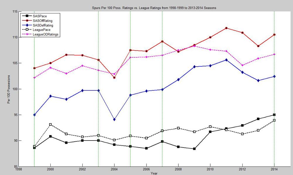 Figure 1. SAS vs. League Average, Per 100 Possession Rating
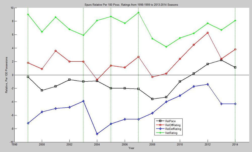 Figure 2. SAS Relative Per 100% Ratings
Figure 1 shows SAS offensive (red) & defensive (blue) ratings, and pace (black), in comparison to the league average rating (dashed pink) and pace (dashed black), from 1999 to 2014 (vertical lines mark SAS championship years). Interesting side note: on average, the league scores as many points as it gives up, as indicated by the fact that there aren’t two separate rating numbers for offensive and defensive efficiency. I don’t know why this wasn’t immediately obvious to me, since the whole league can’t be scoring more points than it’s giving up, but it’s cool nonetheless.
Looking at this graph, we can clearly see in the numbers what we observed on TV: from 1999 to 2009, SAS was consistently below league average in possessions per game (Pace). This is exacerbated by its barely-above-average offensive efficiency, and its penny-pinching defense (check out that huge gap between pink and blue). What does this mean? It means the Spurs played slowly, scored infrequently, and allowed opponents to score even more infrequently, i.e. sleep-inducing basketball. Everyone appreciates good team defense, it’s just… nobody really enjoys watching it. I remember reading that the 2007 Finals had one of the worst TV ratings for NBA Finals, and guess who won? See the vertical line. A small part of me thinks that David Stern went to the Spurs that year and left a phone message like this:
“Congratulations on the championship Pop! I know you guys are a world-class organization and will continue to win rings for years to come, but you’re killing the NBA business. So how about we sponsor you for the next 5 years, giving you honorary NBA Championships, and you take that time to reinvent yourselves to be more TV-friendly? OH and we’ll make churros the official NBA food? Yeah? Yeah.”
…The rest was history. You can see that, starting in 2008, SAS Pace steadily rose until it became above average in 2011, while scoring more points and also giving up more. How much more? Figure 2 shows SAS ratings relative to league average (SAS rating minus league rating). The thin horizontal line marks 0, i.e. league average. We observe almost the same things here, but more magnified. It’s remarkable to see that, from 2008, SAS steadily worked on increasing their Pace and OffRtg every year, whereas the DefRtg got worse probably as a by-product of the faster pace- until 2012, when Pop probably felt that the team was losing their defensive identity. He brought them back down to Earth, was 6 seconds away from another ring, readjusted their game this season to bring the offense up a tick more while maintaining the same defensive efficiency…and Bob’s your uncle: 2014 NBA Champs. At this point, I have a hypothesis as to why this shift occurred, but I’ll keep that to myself till the end. One more note of interest: during the first 4 championships (1999-2007), the Old Spurs maintained almost the same net rating (offensive minus defensive, green), scoring more than their opponent by a consistent margin. The New Spurs struggled to find themselves in the beginning, marked by a large dip in 2008, and slowly climbed its way back to peak in net efficiency this year. There’s so much more to be seen here, like the micro-adjustment between 03 and 05, but I’ll try to stay on topic. This is like a math nerd’s dream come true.
Key Takeaways : Tale of two Spurs- Old Spurs (pre-2008) played slower, scored less but gave up less, while New Spurs played faster and scored more. Both Spurs maintained roughly the same point differentials.
Shooting Numbers In Detail: Spurs’ Evolution Precedes the League’s
Having identified the general trend, as well as the change of identity in 2008, we can take a closer look at both the offensive and defensive numbers in detail, to see where all this extra points came from. Figures 3 and 4 below display the Field Goal (FG) and Freethrow (FT) numbers over the same years, compared to league average. For our non-basketball friends: a field goal includes any kind of shot other than freethrows, i.e. shots that occurred during the regular flow of the game. The insets are as follows: left-FG made, middle-FG attempted, right-FG%. These stats are usually calculated as “per game” stats, thus not accounting for pace. I’ve gone ahead and adjusted both SAS and league average stats to be per 100 possession, getting rid of any possible contamination in cases such as, for example, a team making more field goals simply because it had more possessions, and making a fair comparison between SAS and league. The adjustment is not applicable for the percentage stat.
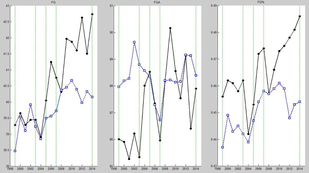 Figure 3. SAS (Black) vs. League (Blue) Field Goal Stats
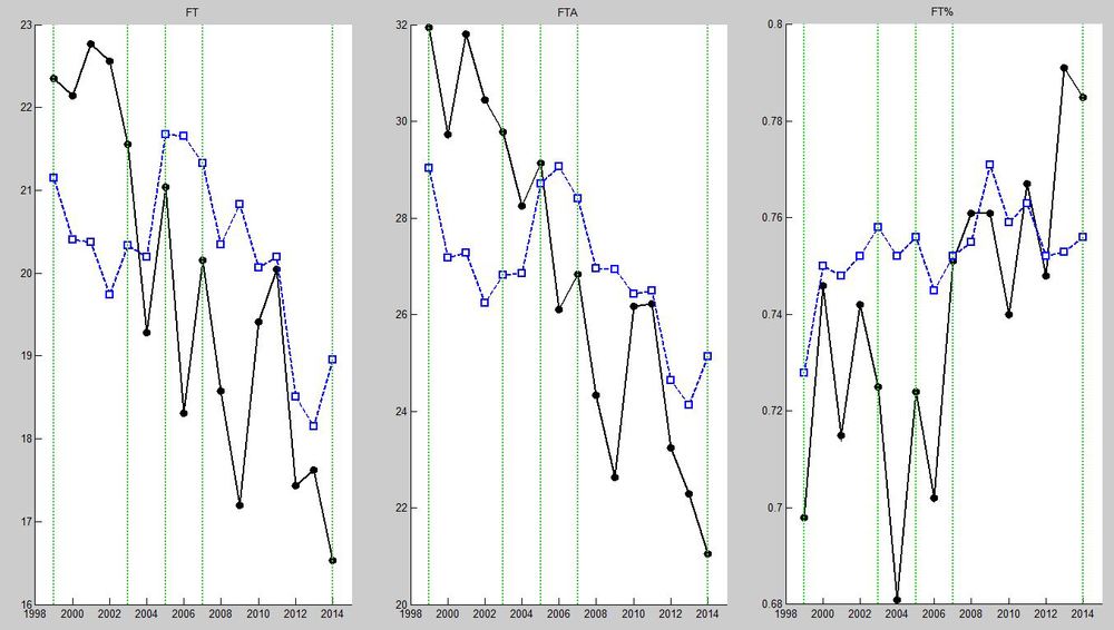 Figure 4. SAS vs. League Freethrow Stats
In Figure 3, you can, once again, clearly distinguish the transformation of the Spurs, which actually came a bit before the 07 title. Old Spurs made as many field goals as the league on average, but attempted much less. As such, we can conclude that their offense, while slow, was still efficient (above average FG%), and their defense held opponents to below average. They were probably much more prone to turnovers since 15-20 possessions in 100 did not result in a shot attempt. The New Spurs was another beast, especially after 08, which attempted roughly the same amount of field goals as the league, but made them at a much higher clip, further increasing their field goal percentage. How does a team attempt more shots per possession? By moving the ball quickly and accurately while minimizing turnovers. I believe an offensive rebound generates a second possession in the stats (correct me?), so an increase in offensive rebounds should not impact the shots per possession stats. Note that the league as a whole didn’t change how much it shot, but became more efficient. Figure 4 shows freethrows per 100 possession, and you can see that both SAS and the league shot less freethrows as the years went on, but while the league maintained its FT%, SAS improved drastically after
- In addition, SAS went from shooting 3 more, per100poss, in 1999 to 4 less, compared to the league. Freethrows usually come from contested shots in the paint, hmm….
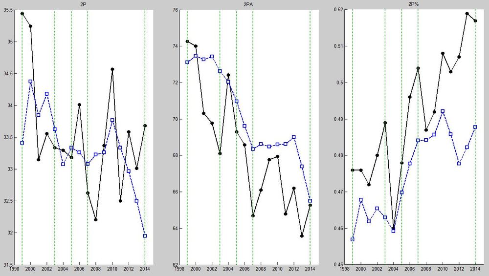 Figure 5. SAS (Black) vs. League (Blue) 2-Point Stats
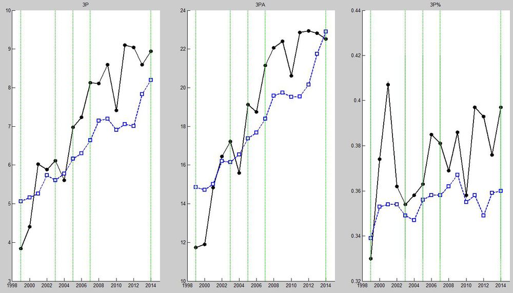 Figure 6. SAS vs. League 3-Point Stats
Seeing how SAS began to attempt and make more field goals, we might ask where these field goals came from, and we have the answers in Figures 5 and 6, showing 2-Point and 3-Point FGs made, attempted, and percentage. Again, these are adjusted to Pace. First, we can notice a league-wide phenomenon, which is that 2-Point shots are attempted less and less, while teams are making them at a higher percentage. At the same time, 3-Point percentage was pretty much constant over the 16 year span, but teams became much happier to shoot the 3 ball, seeing an increase of 9 attempts per 100 possessions. This is consistent with what’s now known as “the Death of the Midrange Jumper”, otherwise known as the Houston Rockets Offense: Layups and 3s. Basically, the philosophy is to shoot more 3s, hopefully efficiently enough, because they give you 1.5X points per shot. Seeing how the difference of a foot in and a foot out of the 3-point arc can give you 50% more points, teams are getting smarter so that they stop shooting longer 2s and just stepping out to shoot the 3. This isn’t groundbreaking news, but what’s interesting is that SAS adopted this strategy much earlier than the rest of the league: the OLD Old Spurs attempted the same number of 2s as the league but made a LOT more, while attempting and making less 3s than average. Circa 2003, they traded away a sizable portion of their 2P attempts, though maintaining or improving their 2P%, for 3P attempts. Finally, we see that, in 2014, SAS is attempting just under the league average for both the 2 and 3, but making almost two more 2s and one more 3 per 100 possessions. All in all, between 1999 and 2014, SAS is shooting about 8 less 2s (making 2 less) and 10 more 3s (making 5 more). Their 2P is so incredibly efficient in 2014, which we saw in the Finals, probably due to all those extra passes.
Key Takeaways : Old Spurs attempted less field goals, particularly the 3, and more free throws, but were great at making their 2P shots. New Spurs shot more altogether, seeing a decrease in attempted 2s for 3s, but were still making an incredible amount of their 2-Point attempts.
Support Stats: Proverbial Nail in the Coffin
The offensive/defensive ratings told us that the Spurs became a faster team and scored more baskets, while the field goal stats shed some insight on how the Spurs were getting their points then and now. So finally, we’ll take a look at the Spurs’ rebounding, assists, and other support stats in the 16-year period. Once again, the numbers are adjusted to Pace, so they represent per 100 possession stats.
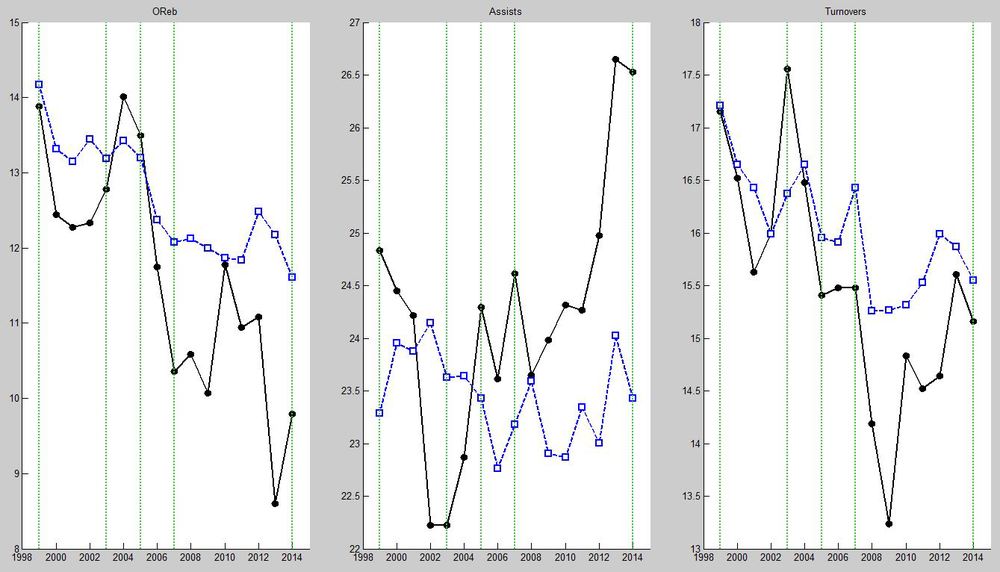 Figure 7. Spurs vs. League Offensive Categories
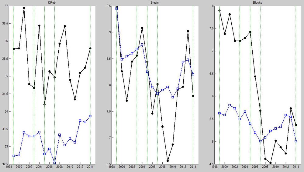 Figure 8. Spurs vs. League Defensive Categories
First, we’ll take a look at the offensive categories (Figure 7): offensive rebounding, assists, and turnovers. The highlight here should be obvious: SAS went from an average/slightly above average assist team, to become a passing machine, beginning in 2009. Assists numbers rose steadily from 09 to 14, resulting in 3 more assists per 100 possessions. In fact, the Spurs has been number one in the league in assists per game for the past two years. Coupled with the high field goal percentage, as well as a slightly higher pace, this combination handily explains the Spurs rise to offensive dominance. In addition, we see in the turnover numbers that, indeed, the Old Spurs were only league average or worse in holding onto the ball, resulting in less shots per possession, whereas they’ve made a conscious effort to cut down on the TO numbers, noting the dramatic decrease starting in 2008. It’s interesting to note that the league as a whole has been taking care of the ball better, though. Finally, we see that their emphasis on crashing the offensive boards decreased over the years as well, except for between 2010-2012. I wonder who used to crash all their misses?
On the flip side, Figure 8 looks at the defensive categories: defensive rebounding, steals, and blocks. We can observe that SAS has consistently been a great defensive rebounding team, and consistently being league average in steals, except for a drop-off between 2008-2010. The drop in steals may or may not have been an experiment in a more disciplined defensive philosophy, though I doubt they had problems in that department prior to then. They did, however, lose Bruce Bowen in 2008 I believe. The final, and most drastic change we can observe on defense, is the blocks stat: steadily decreasing from 7.5 per 100 possessions in 2005, to 4.5 in 2009, and finally recovering to above average in 2013 and 2014. With that, I am convinced of my initial hypothesis on the reason why the Spurs had to change.
Key Takeaway : Spurs’ offensive and defensive philosophy changed in the mid-2000s. They became a great passing team and took better care of the ball, crashed the offensive boards less, and blocked much less shots.
San Antonio Spurs: Master of Father Time
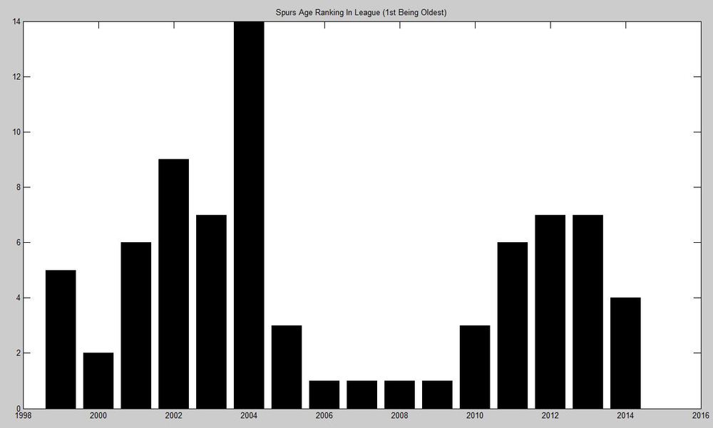 Figure 9. Spurs Age Ranked to League Average (1st = Oldest)
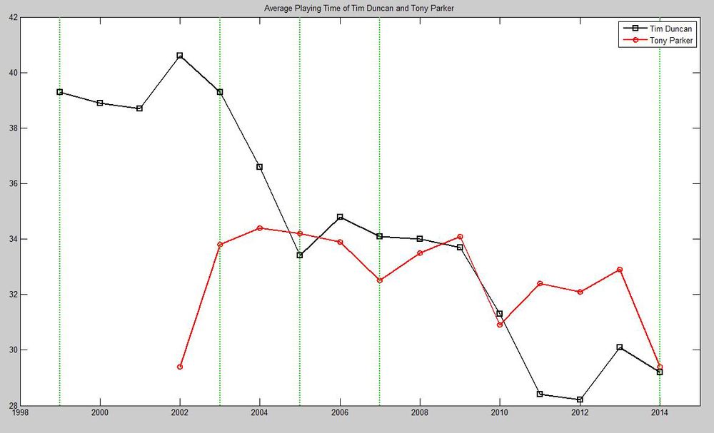 Figure 10. Tim Duncan’s and Tony Parker’s Minutes Per Game
I believe the above two graphs explain most, if not all, of San Antonio’s shift in identity. To the left, the bar graph displays the Spurs’ rank in the league in terms of average player age, 1st being oldest and 30th being youngest. You’ll see that for 4 years in a row (2005/06-2008/09), the Spurs were the oldest team in the NBA. Amazingly, they won a championship in the 06/07 season, but their steady decline due to age wasn’t purely imagination of the public. To alleviate this age issue, specifically, the age issue of one particular player, the Spurs had to change it up. To the right, the line graph shows Tim Duncan’s (black) and Tony Parker’s (red) average playing time, over the 16 seasons. To put it in perspective, Timmy is playing 12 minutes less in 2014 compared to his peak in 2002, which is an entire quarter’s worth of playing time. For comparison, you can see that TeePee’s playing time didn’t drop off quite as dramatically. This changes everything:
Tim Duncan wasn’t the most mobile person, even in his prime, compared to guys that would hop around a lot, like KG. As such, during the early 2000s, the Spurs primarily went to Duncan in the low- to mid-post for a post up or face up shot (I don’t have the advanced stats for this, but I don’t think anyone will throw their hands up in disbelief over that last statement.), hence the larger number of two point shots, as well as a slower offense, for the Old Spurs. However, as Pop started to manage Tim’s minutes heavily, Spurs must do without their primary and most reliable post scorer for a third of the time they usually get, especially without a suitable substitute. This meant that the offense cannot run through the TD-post-up, and while Tony Parker and Manu Ginobili (GINOBILIIIII!) were all-stars - superstars even - in their own rights, they just weren’t the 30-points-a-night kind of guards like a Chris Paul or a Dwyane Wade, which meant that there had to be a more sophisticated system on offense.
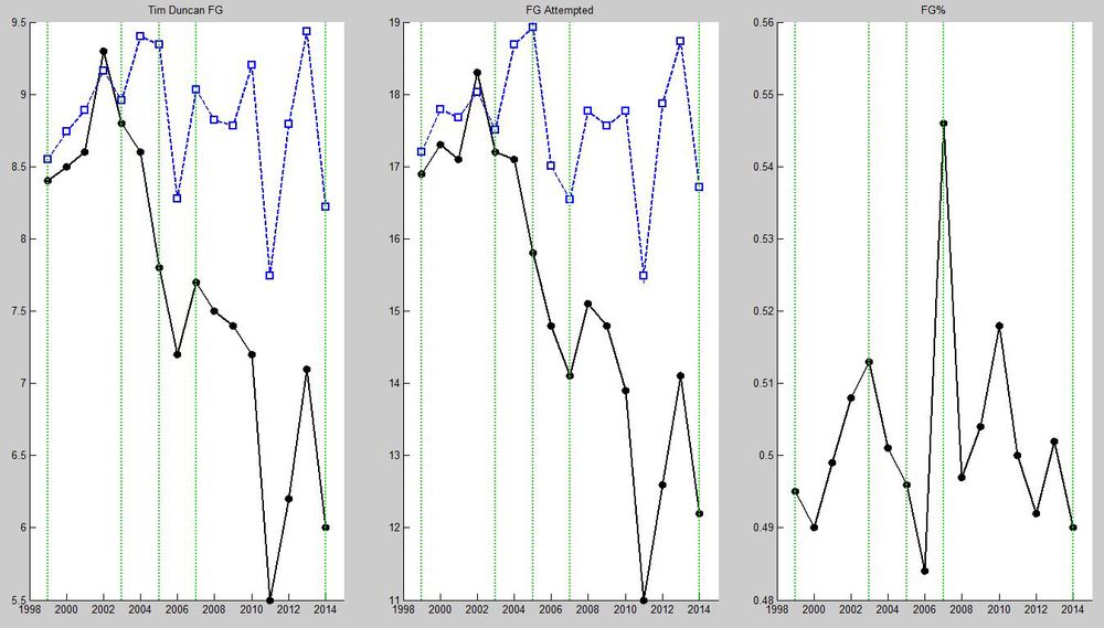 Figure 11. Tim Duncan’s Field Goal Stats
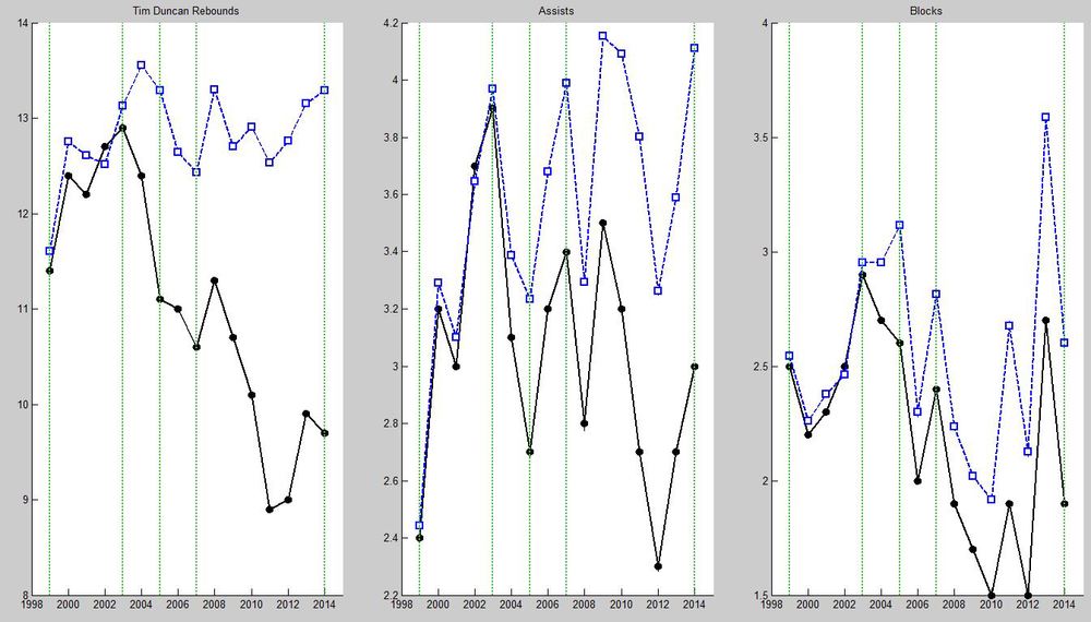 Figure 12. Tim Duncan’s Other Stats
The final two figures display Tim Duncan’s shooting numbers (left) and Reb/Ast/Blk (right). The black lines mark his per game number, whereas the blue lines are his stats normalized to per 40 minutes. These figures suggests that we should give Timmy a new nickname: Mr. Linearity. Both his shots attempted and shots made are proportional to his playing time, as his near constant minute-adjusted shooting stats indicate. Similarly, his rebounding is also constant per-40 minutes, whereas his assists actually increased marginally over the years, plus a surge in block numbers in the past few years. I don’t know what is the more amazing thing here: Tim Duncan’s agelessness in 17 years, or Pop’s ability to squeeze JUST the right amount of work out of Timmy, or both?
The Unsurprising Conclusion
If you told me at the beginning of this whole investigation that the Spurs were old and that Tim Duncan was a legend, I would have said something like, “what, did you just learn how to read the paper?” I really didn’t know what to expect as I first started digging, and I wrote more as I dug further. All I knew was that the Spurs looked a lot better on TV now than they did 6 or 7 years ago, but I wasn’t really sure if that was just a product of Miami imploding or god-knows-what. So it’s really interesting for me to see that 1) yes, the numbers agree with the observation, and more amazingly, 2) while we’ve been saying all these years that the Spurs were too old and writing them off year after year, Pop and the whole organization went ahead and tossed the old Spurs out the window, with the foresight that one day, Tim alone would not be enough to win championships. This serves as a direct contrast in the way Miami is riding LeBron to death this year, maybe he should sign with the Spurs this coming season (hah).
Honestly though: the Spurs getting too old 6 seasons ago was the reason why the Spurs won the title this year. Isn’t that something? Granted, they got their fair share of good luck in drafting Tony, Manu, and more recently, Kawhi Leonard, as well as the revitalization of the likes of Danny Green and Boris Diaw. But as the saying goes, good luck happens to hard working people. I don’t know what could be more unlucky than losing out on a title while being 6 seconds away, but hey, in the end, everything worked out. Thanks for reading, this was really fun.
Post-Analysis Thoughts
First of all, none of this analysis had any statistical backing. Really, it was me looking at lines and judging what correlated with and gasp caused what. So, you know, don’t get too serious about it, I’ll even pass along the polished dataset for anyone interested. I do wish that I had some more advanced metrics to actually give a mechanism for the Spurs’ quicker and more efficient offense, other than the explanation that they had to do it because Tim’s old. Also, I wanted to run some more sophisticated (read:any) analysis tools…well, I did give linear regression a try, and it didn’t turn out to be much more useful than my naked eye. A legitimate caveat of this analysis is that for the field goal and category stats, they are 82-game average stats, adjusted to 82-game average pace, instead of stats averaged to pace per game, then averaged over 82 games. These two routes usually give extremely similar results, especially in a rather large sample size. However, the effect of averaging the average (our case) is that it will erase some of the outliers that would have been present if the stats were adjusted per game, which is less accurate but smooths things out a bit, so we like that.